This was a project completed for the Global Career Accelerator in partnership with L'Oreal and CeraVe. The purpose of the project was to analyze SEO keywords for CeraVe and build a prototype.
the problem
This L'Oréal x CeraVe project was split into two parts: an SEO strategy and a UX design solution.
The SEO portion focused on targeting men who use Google to search for skincare solutions. The goal was to create content that aligned with their search behavior and concerns.
The UX portion aimed to help people who feel overwhelmed when starting a skincare routine by designing a user-friendly solution to guide them through the process.
target market
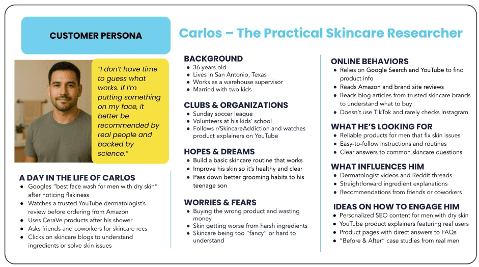
My customer persona was Carlos, a 36-year-old Latino man who uses Google to solve skincare problems like dryness or product confusion. He represents an underserved audience that values functional, science-backed solutions. Carlos isn’t active on Instagram or TikTok, which makes SEO and YouTube key channels for reaching him. He uses search engines to educate himself, compare products, and find straightforward routines.
my role
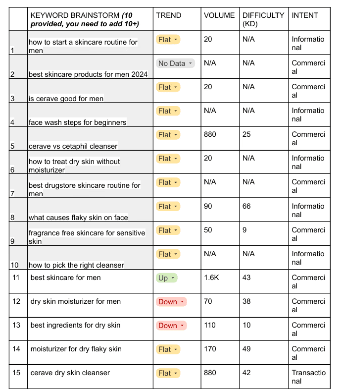
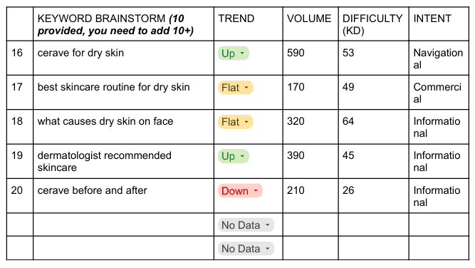
My task was to find 10 additional keywords (for a total of 20) and using tools like Semrush and Google Trends to analyze their trends, search volume, keyword difficulty, and intent. Based on this research, I created sample blog post ideas using the most relevant keywords.
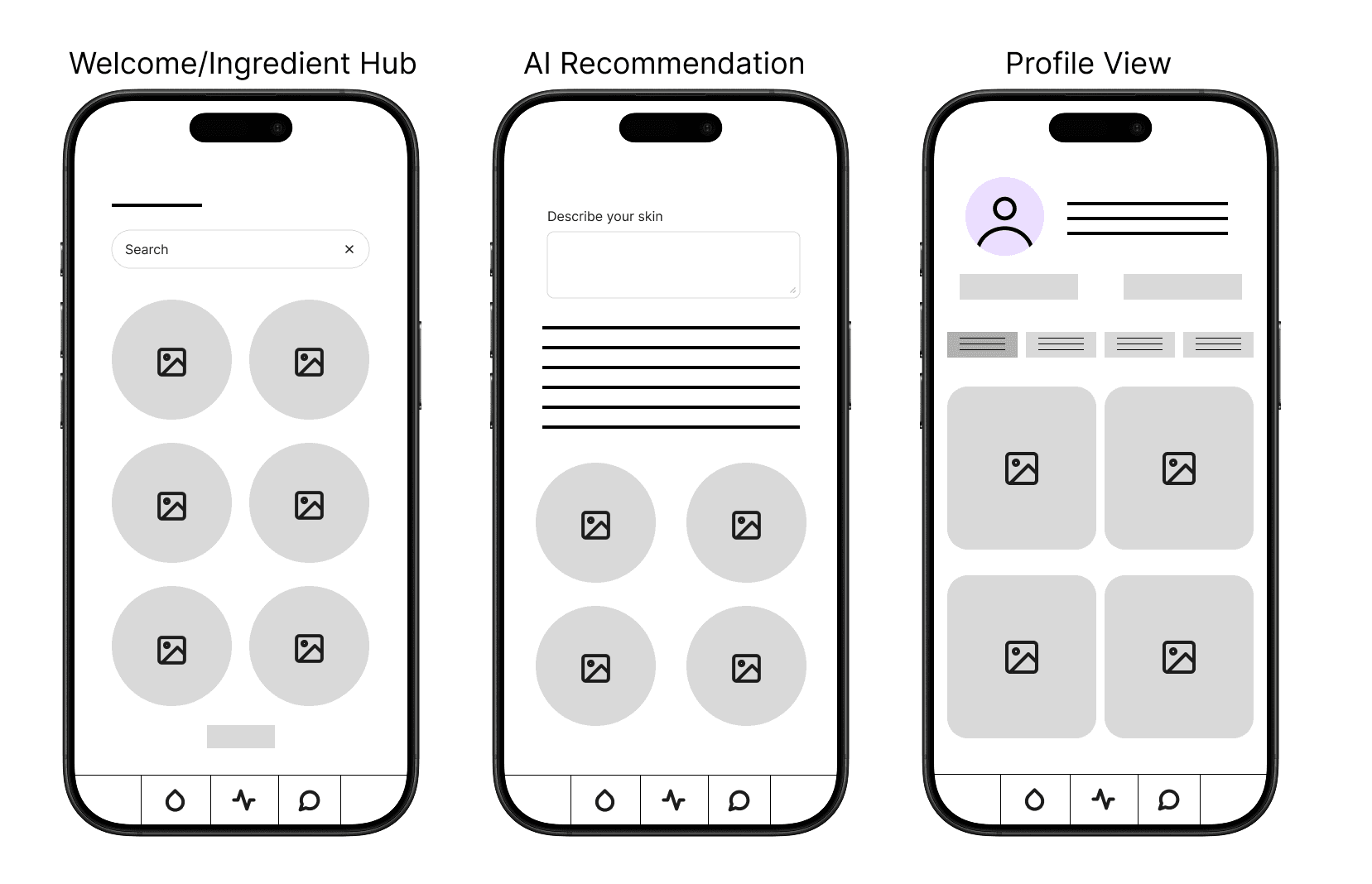
Next, I shifted to the UX portion of the project. The goal was to create a solution for people who feel overwhelmed when starting a skincare routine, especially those confused by conflicting advice or unsure how to choose products that actually work for their skin. After a Crazy 8 brainstorm, these were my top three ideas:
Ingredient Hub: A searchable space where users can learn how specific ingredients affect different skin types.
AI-Powered Recommendations: A tool that asks users about their skin concerns and delivers tailored product suggestions based on ingredient data.
Skincare Profiles: A community feature where users build profiles that include their routines, favorite products, reviews, and photos. Others with similar skin types can browse and connect.
Then, I used Figma to create some mid-fidelity wireframes. A small, clickable prototype can be found here. My final task was to share my wireframes and prototype with an audience and reflect on my feedback.
what I learned
The UX portion of this project was definitely a challenge since it was my first time working in this space, but it was also the part I was most excited about, because UX is a field I really want to grow in.
Wireframing and testing taught me an important lesson: it’s easy to assume that people will understand how to use something you’ve designed. Some of my testers were confused, especially since they were looking at simple wireframes without any context. It made me realize how important it is to clearly communicate your design, even in its simplest version.
I also learned that trying to cram too much into one wireframe can backfire. I should have broken the flow into smaller, task-specific pieces instead. There’s so much more to UX and UI design than I initially thought. You can’t make assumptions. Every user is different. The psychology behind how we interact with digital tools is important, and that’s exactly why this field matters so much.